Widgets by category
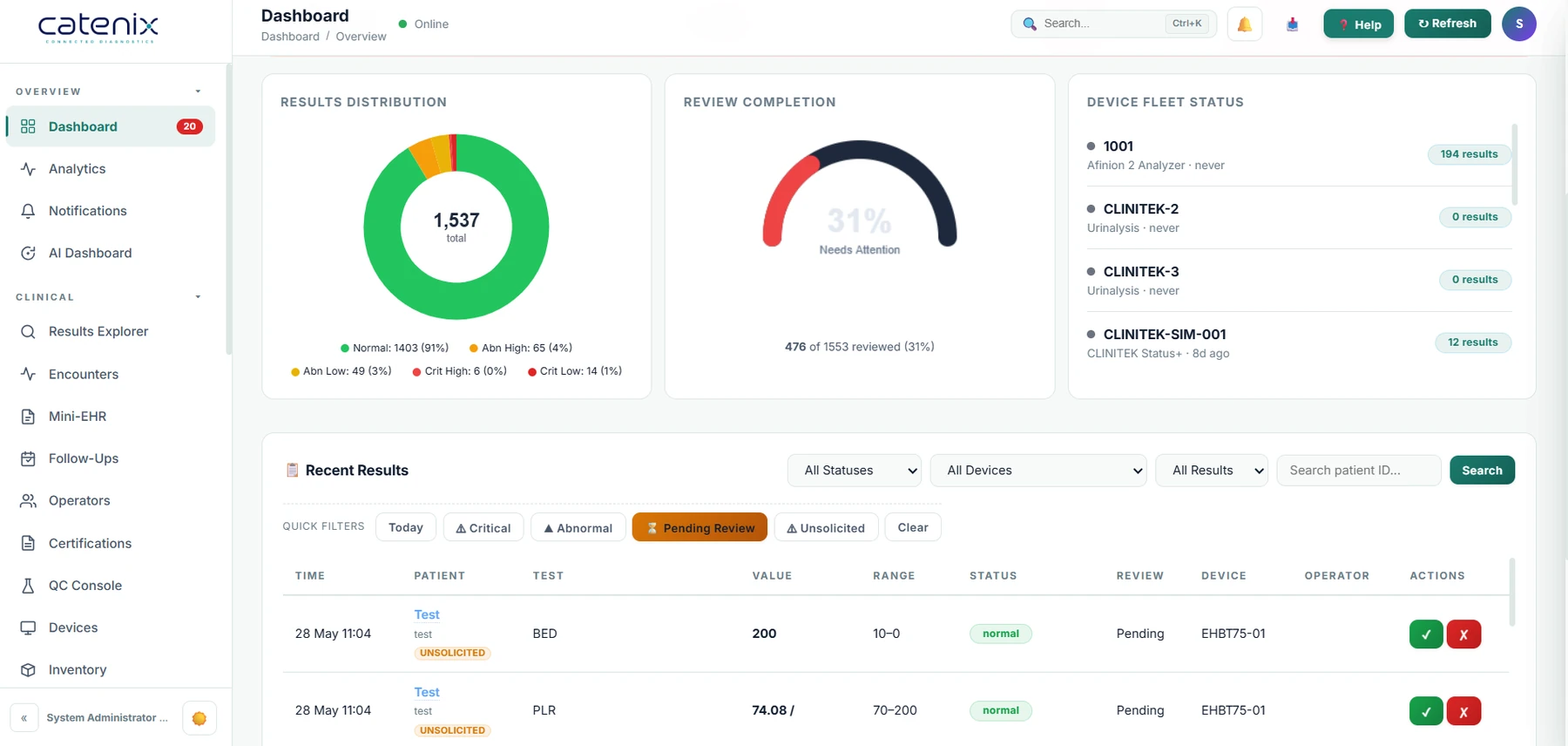
Results, QC, Devices, Operators, Quality, Performance, Stock, Attention and Analytics: 46 widgets, each with its own settings, from KPI tiles and gauges to line, bar, donut, heat-map, table and list views.

Home / Platform / Dashboards & analytics
Core platform
A POCT lead wants overdue QC by ward and silent devices. A quality manager wants open NCs, CAPA ageing and sigma. An executive wants volumes and turnaround. One dashboard cannot be all of those, so Catenix lets each person arrange their own from the same live data.
The dashboard
Results, QC, Devices, Operators, Quality, Performance, Stock, Attention and Analytics: 46 widgets, each with its own settings, from KPI tiles and gauges to line, bar, donut, heat-map, table and list views.
Drag a header to move, drag a corner to resize, pick from a searchable palette, change a widget's settings from its own schema, reset to a preset, save. Everything snaps to a 12-column grid.
POCT lead, QC coordinator, Ward manager, Quality manager and Executive layouts to start from. An administrator can set the organisation default; each person keeps their own on top.
Auto-refresh every 60 seconds while you are not editing. Widget data is fetched in one batch and cached briefly per organisation, so a busy dashboard stays light on the server.
The critical-alert banner and the recent-results worklist remain visible whatever layout you choose.
Sigma overview from the Workbench, quality attention from Quality Management, turnaround from analytics, Action Centre signals, your notifications and any saved Studio view.
Analytics Studio
Example questions: QC failures by operator by month; median turnaround by device by hour of day; certifications expiring within 60 days by ward; stock value by lot expiring this quarter.
Reports that arrive
Daily, weekly or monthly, with next-run maths that clamps month ends and never schedules into the past. Each run is logged with its outcome.
Reports go out through the platform's email service; a schedule whose last run failed shows in the Action Centre with the reason in its history.
Background work runs on a durable queue with retries, timeouts, leases and a dead-letter list you can requeue from the Jobs and schedules panel.
A clear boundary
Catenix is connectivity, workflow, record-keeping and data display. It does not interpret results, calculate clinical values, classify or flag results clinically, or provide clinical decision support. Statistics describe methods, processes and datasets, never a patient. Any reference range or note shown is customer-authored content Catenix displays.
Questions, answered
Yes. Layouts are per user, with an organisation default that administrators set, and role presets (POCT lead, QC coordinator, Ward manager, Quality manager, Executive) as starting points. Reset returns to the preset at any time.
Results (with turnaround, transmission and critical flags), QC (with failures and z-scores), devices, operators, certifications with days to expiry, CAPAs, non-conformances, incidents with days open, EQA, consumables with stock value, and workbench analyses. Dimensions include date grains from hour to year, weekday and hour of day; measures include count, distinct count, sum, average, median, 95th percentile, minimum, maximum and share of total.
A saved view is yours or shared with the organisation; only the owner edits or deletes it. Any saved view can be pinned to the dashboard as a widget, exported to CSV or printed.
Yes. Report schedules are persisted and executed by the job scheduler with a run history per schedule, a preview, and email delivery when mail is configured. A schedule whose last run failed shows up in the Action Centre.
No. Dashboards and Studio count, aggregate and chart operational data. They do not interpret results or offer clinical decision support.
Tell us your role and we will start from the matching preset on a live tenant, then answer a question of yours in Analytics Studio.